Customer’s request
The satellite constellation – what will become Europe’s most important low altitude Earth Observation satellite programme – will be built In Italy and completed within five years with the support of the ESA – European Space Agency and the Italian Space Agency thanks to PNRR resources.
This mission will support the Civil protection and other administrations to combat hydrogeological instability and fires, protect the coastline, monitor critical infrastructure, air quality and weather conditions.
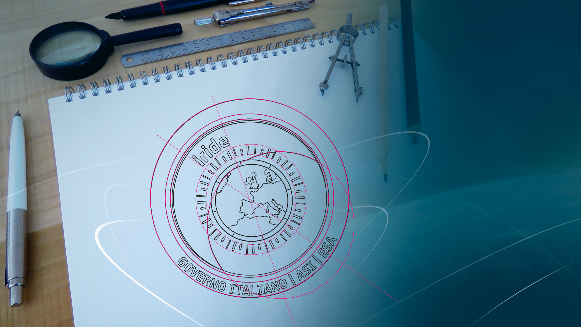
ReMedia was involved in the design of the new patch, which describes the mission objectives in detail and at the same time aesthetically impressive.
Our solution
Inspired by the name of the mission, IRIDE, we developed three different graphic concepts, designing proposals that had has their starting point the ieris of the human eye, acting as a container for all the elements of the mission, in a circular patch.
The core elements of the project are:
- The instruments and purpose of the mission.
- The constellation of the satellites already in orbit over Europe, will play a key role in achieving the objectives.
- The main actors of the mission: ESA, ASI, Italian government; the promotion of the patch production in Italy.
- The place where the mission will be implemented, the area from Marocco to Denmark.
- The services provided will be used for the protection of the earth and to achieve the purpose of the mission by promoting, developing, and expanding knowledge of scientific and technological research.
- The future and innovation.
The above was represented graphically in the proposals for the Iride mission; even the colours used were not chosen randomly, but always aimed at recalling the objectives and constituent elements of the project, enriching the patch with meaning, and making it extremely eye-catching.
The proposal designed by ReMedia’s graphics team were put to a public vote via the italian government website and the social platforms of those involved in the mission, leaving the choice of the patch to the users!
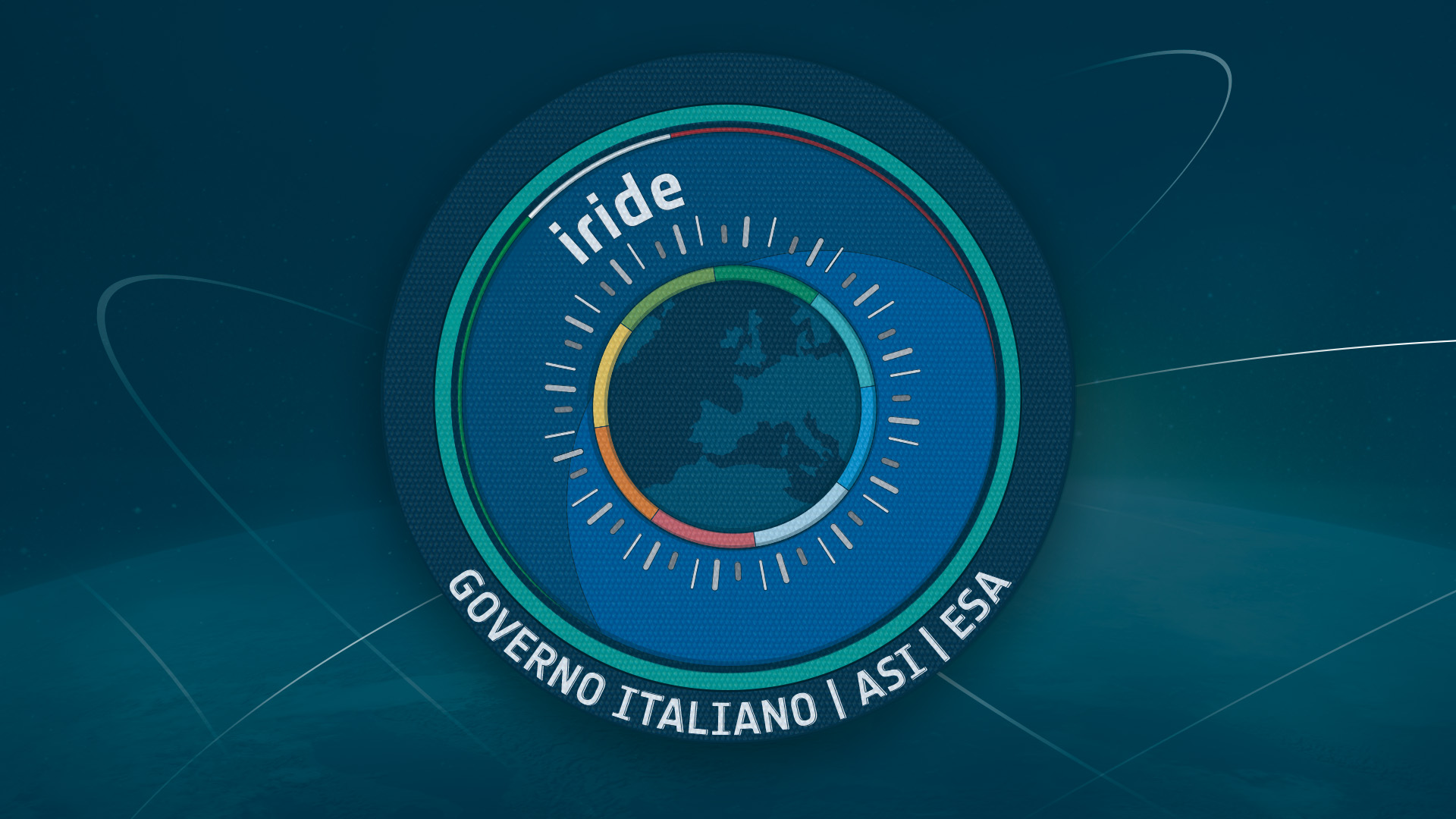
Winning proposal, n°2:
The representation of Europe and the Italian flag are a reminder of the participants and the location of the mission, ESA, ASI, the Italian government, and the promotion of the patch’s production in Italy.
The decision to use different shaped lines surrounding Europe, stems from the idea of depicting the 48 satellites already in orbit, and distinguishing their different roles by representing the three types of use for the mission:
Even the choice of colours is not random; each of them has a specific meaning to represent the services and purposes of the mission:
- Optical
- Radar
- Spectral (to be seen)
Even the choice of colours is not random; each of them has a specific meaning to represent the services and purposes of the mission:
- Yellow: Coastal and marine littoral monitoring
- Light blue: Air quality
- Dark green: Land cover
- Orange: Soil movement
- Light blue: Hydro-weather-climate
- Red: Emergency
- Light green: Security
- Blue: Water resources
Client
ESA – ASI - ESA, Italian government
Sector
Space
Project Name
IRIDE space mission
Project type
Marketing & Digital communication
Realization
2022–2023