In May 2018 SNAITECH launched interannaly an innovative procedural sofwtare that needed to be used in a very short time by a large-scale audience.
Our answer
Remedia in less than two months produced an e-learning course through which more than 2000 geo-localized points of sale, in different Italian, have been trained on a complex and completely new system. We structured the course following the customer’s guidelines, designing a software enriched with multimedia content able to grasp user’s attention and making the training interactive and interesting.
Once this project was completed, we were commissioned to make other digital training materials, and we have also created an interactive manual in html5, fully responsive and very easy to be updated. All the training materials developed are provided through the Relearnit platform.
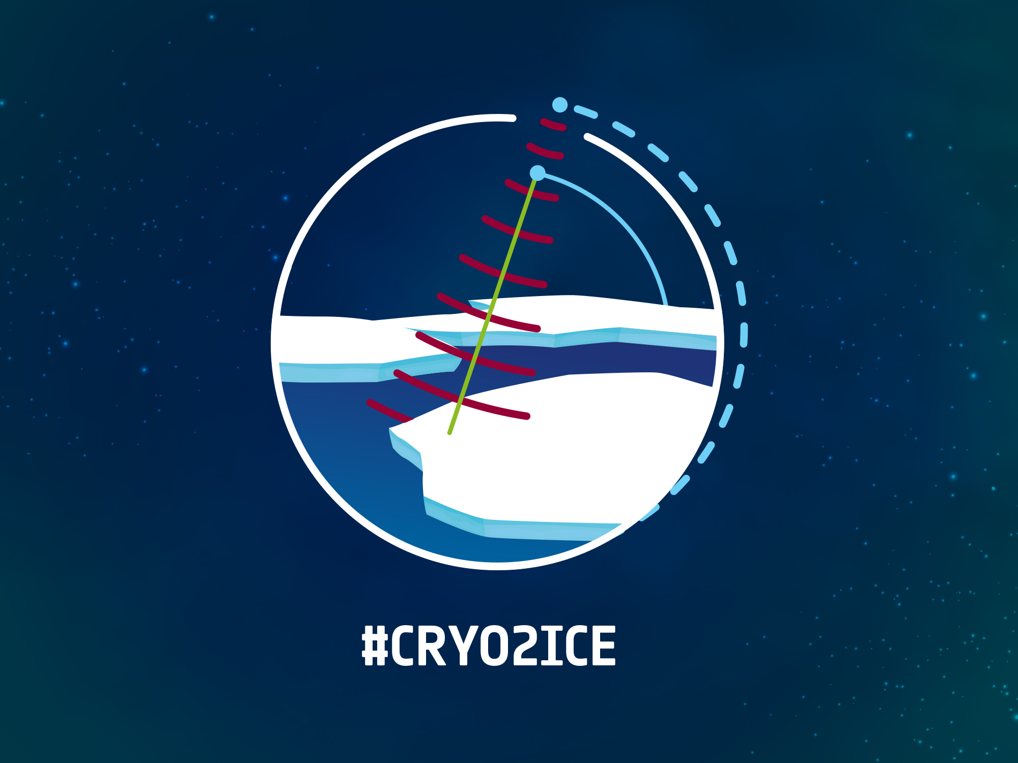
In July 2020, NASA and ESA launched a tandem mission: CRYO2ICE with the aim of analyzing the conditions of the surface and the innermost part of the glaciers present at the Poles.
The mission plans to integrate data from instruments aboard two satellites already in orbit, the radar of ESA’s Cryosat satellite and the laser of NASA’s ICESAT satellite to achieve a deeper understanding of Earth’s ice, without the need to create a new satellite.
Thanks to a “magic” of celestial mechanics, but above all to the scientists who work for these two missions, it was in fact realized that a small shift in the orbit of Cryosat would be enough to align the orbits of both satellites to allow him to find himself analyzing the same territory at the same time, especially in coincidence with the polar winters, therefore every 6 months. Remedia was asked to tell this “magic” to the general public in the simplest way possible.
Our answer
The magic was initially told starting from the Keyvisual of this fabulous mission, illustrating the two satellites protagonists of the campaign, the technology applied to them (radar and laser) and the precise exchange of information that occurs only with the displacement of 900 m of the orbit. , within two weeks. In the keyvisual, the two Cryosat and icesat satellites are represented in different colors, together with the communicative action that occurs between them and the data collection mechanism through the study and analysis of the polar caps.
The Keyvisual has been designed to be able to customize gadgets and make any other communication tool used for the promotion of Cryo2ice recognizable: from the teaser to the docu-video. The teaser conveyed the communication by generating expectation and expectation and was published on all official ESA channels; The video tells, even to a less qualified audience, in a simple and accurate way through images and texts the mission and its purpose. A success from every point of view if you think that the 10th anniversary of Cryosat2ice contributed to enriching this project!
Furthermore, on the occasion of the maneuver, all the staff of ESA and NASA wore the personalized t-shirt, making this event unique and unforgettable in history.
Well-being comes from proper nutrition and a healthy lifestyle. This concept should represent a “mantra” for every human being to follow in every period of his existence, especially since he is very young.
For this reason and to raise awareness among students of both primary and secondary school, on the increasingly looming danger of childhood obesity and food-related diseases, we were commissioned by the MIUR for a publication that would tell children about the concrete need to a healthy and balanced diet and the right motor activity, throughout your life.
Our answer
To respond effectively to the customer’s request, we first analyzed the target of the publication, its communication style and the communication channels to which it was closest. Thinking about digital natives, we immediately thought that the publication could not be printed, but digital. In the initial phase we divided our stakeholders into two distinct audience groups: elementary / middle school children and teenagers (13 – 18 years). We have thus chosen to undertake two different communication approaches, both in the graphic style and in the contents but with a single denominator, the technological solution: a touchbook.
Thanks to this tool we have created an innovative publication:
for the little ones, full of games and illustrations dedicated to nutrition and sport
for the older ones accompanied by columns, curiosities and information so as to make it look like a diary.
With the advent of Expo 2015 it was decided to expand the product even further by adding content dedicated to food as “nourishment for the planet and energy for life”, as the theme of the Universal Exposition stated. The result was very positive and the project closed with the approval of the Ministry of Education, a press conference, a communication campaign and dedicated pages in school newspapers.
In addition, to allow wider use to all the public of the EXPO, the touchbook has been published on all major Kindle, Android and Apple stores and in 3 languages: Italian, French and English.
In December 2017, the Lottomatica training department requested an e-learning course approched to all tobacco bar managers authorized to sell Scratch & Win.
In fact, according to Italian law and the regulations in force, whoever supplies this product / service is obliged to be trained in all phases of product sales and management procedures, from the sale of the ticket to the winning.
In 2018, given the positive results obtained, the client commissioned us two new training projects, one relating to anti-money laundering for the VLT halls and another for the betting halls.
The internal audience was used to e-learning with a video and pdf manuals.
Our answer
In 2017, when we were commissioned the first e-learning project, we presented to the client our ways of creating an e-learning course and we worked together on a storyboard capable of supporting user involvement and building the right mix of interactivity and multimedia to make even the most technical and specific, interesting and stimulating contents.
We have thus created a Scorm compliant course, which can be used within the Lottomatica Moodle platform, with a mandatory final questionnaire to be administered to each participant who has exceeded the client’s expectations in terms of learning outcomes of the course subject and the number of active participants.
In 2018, two other important e-learning projects followed on topics relating to the rules and preventive anti-money laundering measures for the VLT and betting halls that each operator undertakes to adopt.
We are proud of the work carried out from 2017 to today and equally happy to be chosen, after four years, by Lottomatica for further projects dedicated to the world of digital training!
Surfing the digital waves to successfully promote a broad space initiative
The client’s request:
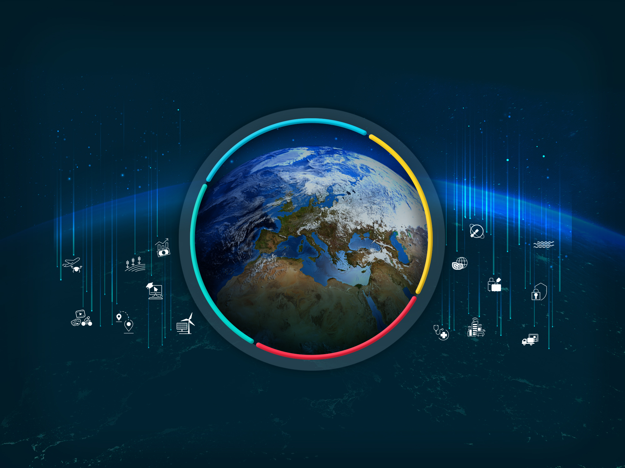
The downstream gateway is a new initiative of The European Space Agency launched in 2020, which offers an incredible set of services and funds to European companies to make business and research. Since the wide audience to which it is devoted and the great variety of its proposal ESA were in search of a partner able to simplify this complexity in a simple and clear identity able to catch the target’s attention. Moreover, the time of the launch of initiative was in the fall of the Covid pandemia, thus they were in need to use just digital tools to reach their communication goals.
Our answer:
ReMedia started his work designing a strong illustration that was able to include in one image all the important information we had to communicate to the target. All the applications have been depicted as rain of stars falling on the ground: an incredible opportunity of fertilisation for all european companies and academias.
Following this approach ReMedia created digital brochures to explain how to access the different fundings opportunities, teasers that have been spread over the social media to present examples of applications able to inspire the audience, and many kinds of social media graphics to promote online events in which present specific prospects. All these tools are then framed in a very informative and attractive website, for which we designed all the graphics and the layout, in which the target could indeed understand how to access this incredible gateway and start working with the ESA Downstream initiative.
The client had requested to create a new mascot for children that could personify the values and activities of ESA in order to create ad hoc gadgets and materials that can then be sold through the online shop of the European Space Agency.
Our response:
The mascot is in fact a fun and impactful tool that allows you to communicate the values of the brand by approaching a younger and more dynamic audience to be adapted to any type of merchandising.
During the conception phase, a gnat dressed as an astronaut was chosen and named “Astrognat” to remember that these insects were the first living beings sent into space for scientific studies. Thinking about the final use of the mascot, a very versatile character was designed that would allow you to change its appearance according to the needs and context of reference.
The mascot was designed right from the start in two settings: in space and during training on Earth. An entire and vast line of merchandising linked to this character was then created and in 2020 other settings were commissioned: on the Moon, inside the Moon Village, on Mars and Inside a spaceship in the company of his friend Paxi, another ESA mascot for the little ones.
How to make the most of the largest Earth Observation program ever made.
The customer’s request:
The Copernicus project is the largest Earth Observation program ever promoted by the European Commission with the support of ESA for the construction of a constellation of satellites and the Environment Agency (EEA) for Earth data detection.
The articulated nature of Copernicus, technical and difficult to understand by a non-technical public, brought ESA to contact us initially to convert an institutional brochure into a digital tool, applied to the general public with the aim of describing the program and the actors involved.
Our answer:
As soon as the customer’s request arrived, we immediately realized the enormous potential of this project: we had the opportunity to develop an innovative digital tool that really presented all the value and potential of the program from different points of view, given the nature and the flexibility of the object we had in our hands.
With this idea in mind, we have created the architecture of the project on several conceptual levels: on the one hand we have created an institutional, digital communication tool, able to speak to stakeholders and the most experienced public, but in parallel we have created it another able to speak directly to those citizens who will be the true beneficiaries of the program for the first time.
Thus was born the Copernicus touchbook, a project born from a real teamwork that from 2016 to 2018 involved us directly together with many experts of the contents of ESA and the European Commission to give life to a unique and innovative communication tool that was at the height of the program it was to represent.
Most of the work was dedicated to the storytelling part for each Copernicus application, to describe their impact on everyday life. Different stories have thus seen the light that use all the tools to engage the reader such as quizzes, games, interactive infographics, 3D animations, video and audio to explain to everyone the connections between satellite data and the services that can derive from them to improve. the quality of our life.
L’obiettivo principale della missione Copernicus Sentinel 5P è effettuare misurazioni atmosferiche dettagliate per far comprendere a tutti noi più da vicino le possibili cause dell’effetto serra e della generazione dei 5 gas prodotti da fonti naturali e non naturali (incendi, deforestazione, contaminazione ambientale, inquinamento, ecc.) Lo strumento per rilevare questi importantissimi dati è Tropomi, un dispositivo interno al satellite che registra costantemente queste informazioni utili per sensibilizzare e renderci consapevoli dello stato di salute del pianeta in cui viviamo. Nel 2017 l’ESA ci ha incaricato di intervenire su un importante progetto di storytelling volto a raccontare la missione Sentinel5P in modo semplice e chiaro.
La nostra risposta
A questo proposito abbiamo realizzato un’infografica che spiega in modo del tutto versatile l’impatto dei gas serra sull’atmosfera. La complessità del progetto è legata alla realizzazione di un fenomeno ambientale che l’essere umano non percepisce pienamente.
Utilizzando l’infografica abbiamo potuto declinare e veicolare queste informazioni con facilità, con icone, immagini e testi sui canali social e offline, potendo contare su uno strumento chiaro e facilmente fruibile, oltre che di notevole impatto visivo.
The main objective of the Copernicus Sentinel 5P mission is to perform detailed atmospheric measurements to make all of us understand more closely the possible causes of the greenhouse effect and the generation of the 5 gases produced by natural and non-natural sources (fires, deforestation , environmental contamination, pollution, etc.) The instrument for detecting these very important data is Tropomi, a device inside the satellite that constantly records this information useful for raising awareness and making us aware of the state of health of the planet in which we live. In 2017, ESA commissioned us to intervene on a significant storytelling project aimed to tell the Sentinel5P mission in a simple and clear way.
Our answer:
In this regard, we have created an infographic that explains the impact of greenhouse gases on the atmosphere in a completely versatile way. The complexity of the project is linked to the realization of an environmental phenomenon that the human being does not fully perceive. Using the infographic we were able to decline and convey this information with ease, with icons, images and texts on social and offline channels, relying on a clear and easily usable tool, as well as having a considerable visual impact.